Optimizing your newsletter's landing page can be the difference maker that gets you thousands of extra subscribers.
Here's some quick math:
- 25% Conversion Rate on 5,000 Visits: 1250
- 50% Conversion Rate on 5,000 Visits: 2500
And with this guide you'll be well on your way to 50% conversion rates (not exaggerating).
Last week we talked about your Welcome Flow in our deep dive on How To Build The Best Newsletter Welcome Page And Email.
This time we're adding in the ultimate landing page with my 4x4 landing page guide, and completing our full subscriber flow.
For reference:
- Welcome Flow = Welcome Page and Welcome Email
- Subscriber Flow = Landing Page, Welcome Page and Welcome Email
I like to keep them separate to really focus in on the two different aspects - but we will have some overlap (mainly our UVP).
As we learned in for our Welcome Flow: telling our audience what they're getting is extremely important.
Being able to clearly (and concisely) tell them the benefit of joining our newsletter is going to be absolutely vital for our landing page.
That said, we'll be making our way through my 4x4 landing page structure using some of the top newsletter examples, same as always.
The 4x4 Landing Page Structure is made up of:
- The 4 Essentials
- The 4 Sections
And here's what each of those look like...
The 4 Essentials:
- What do you do for your audience?
- When should they expect it in their inbox?
- How long will it take to read?
- How many others will they be joining?
Again, some of this should look familiar from our Welcome Flow.
The 4 Sections:
- The Main Heading
- The Secondary Heading
- The Call To Action
- The Sub-Text (Optional)
And from there we'll be going over some bonus information to really craft the ultimate newsletter landing page.
 The 4 Essentials
We're going to be starting with The 4 Essentials, which are the four topics we're going to be covering on our landing page.
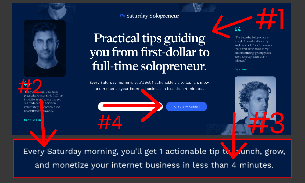
in the image above I'm using Justin Welsh's landing page for his newsletter The Saturday Solopreneur, which is one we've seen in quite a few of our deep dives now.
I marked each of our 4 Essentials in the image, and as a reminder, here are the things we're going to be looking at (coinciding with the number marked above):
- What do you do for your audience?
- When should they expect it in their inbox?
- How long will it take to read?
- How many others will they be joining?
Let's break it down.

We'll go through each section of Justin's landing page, and then I'll be going through each section individually with a few more landing pages for each one.
Let's start with "What do you do for your audience?"
As you can see, Justin writes:
"Practical tips guiding you from first-dollar to full-time solopreneur."
Justin has a very specific value proposition, and expands on it in his secondary text while touching on more of our 4 Essentials.
But first let's discuss "What do you do for your audience?" a bit more.
What is your value proposition?
Your value proposition or UVP (unique value proposition) is a statement that clearly tells your potential customers how they will benefit from your offer (in this case, newsletter).
If you don't know how to share this extremely clear and concisely, you can't expect your audience to know what they're getting by subscribing.
You need to make the process as frictionless as possible.
As Daniel Kahneman said: “Thinking is to humans as swimming is to cats”.
Keep it extremely simple.
This is absolutely crucial.
Not just for your landing page, but for your entire Creator Newsletter business.
Next up we'll be taking a look at the secondary header, which Justin uses to touch on "When should they expect you in their inbox?" and also "How long will it take to read?"
Here's what he writes:
Every Saturday morning, you'll get 1 actionable tip to launch, grow, and monetize your internet business in less than 4 minutes.
Right away Justin tells us when we can expect it: Every Saturday morning.
From there he goes on to expand on his value proposition, finishing off with how long it will take to read: less than 4 minutes.
And finally, we learn how many subscribers we'll be joining with his Call To Action (Button), which is something I don't see many landing pages use, but a methodology that fits perfectly on Justin's page.
 Section #1: The Main Headline
Now let's go through each one of our 4 Essentials in each individual spot we'll be covering them with using the 4 sections of our landing page.
Starting with our Main Headline.
Our Main Headline is always going to be where we put our "What do we do for our audience?"
Or, as we analyzed above: our UVP (Unique Value Proposition).
Your main heading needs to explain exactly what you do, FOR YOUR AUDIENCE, extremely quickly.
This should be a benefit based headline.
This isn't about you. This is about what your newsletter will do for your audience.
Another way to think about it is to look at it from the perspective of your newsletter having a specific Jobs To Be Done.
Matt McGarry of Grow Letter (a newsletter growth agency) says:
“Find one job to be done that you can do better than anyone else in the world.”
Here are some examples [Matt shares] of newsletters doing an amazing job of that:
- Help me become a better dad: Daily Dad
- Keep me informed with just the facts: 1440
- Keep me up to date on tech in 5 minutes: TLDR
- Help me win more at fantasy football: Football guys
- Help me sell more sponsorships: Creator Wizard
- Help me build better habits: James Clear
- Make me smarter about crypto: Milk Road
You should be aiming to get this as concise as possible with your newsletter's UVP / Jobs To Be Done.
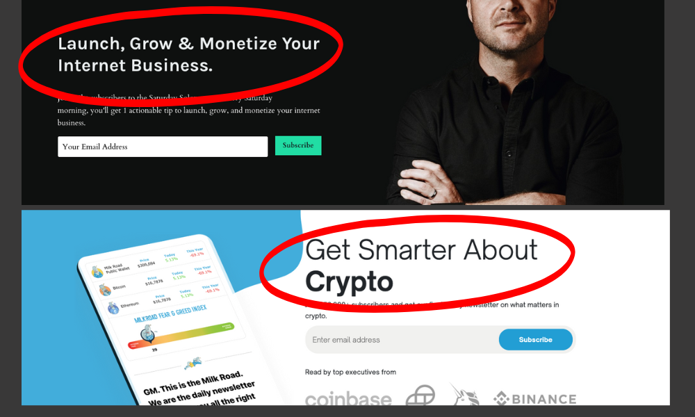
Let's analyze the two images I shared above...

As you can tell from the first image, which is Justin Welsh's old landing page for his [same] newsletter; his main headline changed.
He's teaching a similar subject, and his newsletter's job to be done is very similar, but he changed his value proposition to better explain to his audience exactly what they're going to get when they subscribe to his newsletter.
You should be consistently testing and optimizing your landing page to test for better conversions.

You saw Milk Road on the list above.
Their Jobs To Be Done is listed as: Make me smarter about crypto.
And guess what...
That's exactly what they're telling you in their main headline.
"Get Smarter About Crypto".
If you can get this concise, do it.
 Section #2: The Secondary Headline
Your secondary headline can really be used to hit on every other piece of your 4 Essentials, while also building on your value proposition.
That said, it's important to note you do have an optional sub-text space you can use, as well at the option to use your CTA button like Justin Welsh did in our first example.
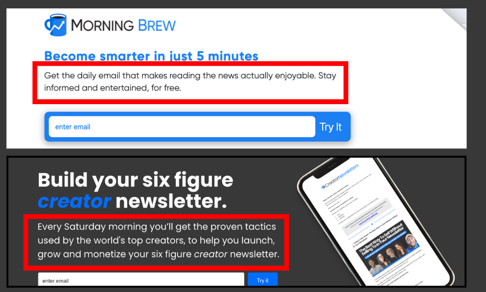
I'm sharing not only Morning Brew's landing page (which is another Media-Brand Newsletter; you can learn more about the different newsletter business models here), but also my own to show you some nuances of the 4 Essentials.
We'll start with Morning Brew's newsletter.

Morning Brew's secondary headline is short and to the point, but it does a few things we can examine:
- It immediately tells you when you should expect it in your inbox: Daily.
- It tells you more about their value proposition.
- It tells you that it's free.
As you can tell, Morning Brew doesn't include how many subscriber you'll be joining.
While they have the power to leverage herd mentality with the hundreds of thousands of subscribers they choose to keep it extremely short and concise.
This is a decision that's entirely up to you, and will be one of the things you'll need to test as you begin getting more of your audience sent to your landing page.

The second example is my own secondary headline right on our homepage.
As you can tell, I also immediately tell you when you should expect the newsletter in your inbox, but then I use the rest of the secondary headline to build on my value proposition.
Here's why:
- I decided to use my sub-text to tell people how many subscribers they will be joining (which is a fairly popular decision among newsletter landing pages).
- I DON'T tell you how long it will take you to read as a selling point because my deep dives are often extremely long.
It wouldn't be much of a selling point to say "It'll only take a ton of time to read each week because I give so much dang value!" 
This is ultimately something you need to be aware of, and be able to pick and choose which of the 4 Essentials are actually essential in your unique situation.
Note: If you only have 50 subscribers, it's probably not a selling point yet. This is part of the awareness you will need to have to be able to make changes on your own.
 Section #3: The Call To Action
The next section is our Call To Action.
This one is pretty obvious, but still has to be touched on.
Your Call To Action should always come after your Main Headline and Secondary Headline and sit between those and your Sub-Text.
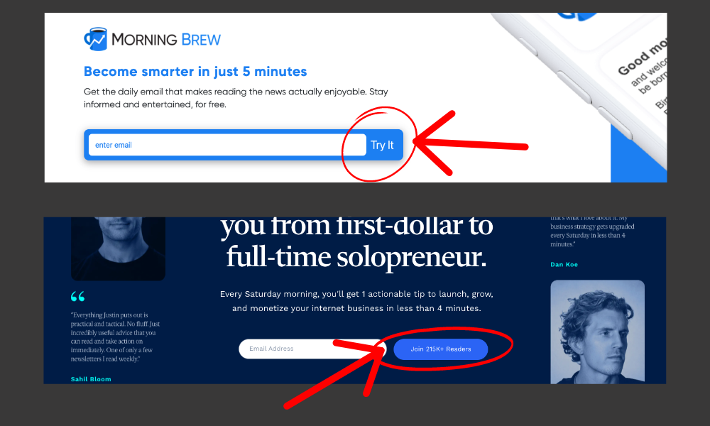
It's your choice what you want to write on your CTA button, but I personally prefer "Try it" because it's a gentle nudge.
Plenty of newsletters are successfully using a CTA text as simple as "Subscribe", so I wouldn't stress this too much.
The most important part is the positioning of your CTA on your landing page.
 Section #4: The Sub-Text
Finally we have our Sub-Text, which is our final chance to hit all of our 4 Essentials on our landing page.
I usually say this is optional, but it's usually a good place to put the cherry on top of your landing page details.
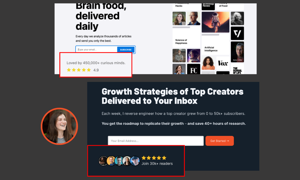
More-often than not I see creators using it to share the amount of subscribers you'll be joining by signing up (like we see in the image above), but you really can get extremely creative with this section.
For example, I like using it to add a "lead magnet" or some kind of bonus.
Right now my sub-text says:
Join 1000+ creators and get instant access to "The Ultimate Guide To Lead Magnets" for free.
The Ultimate Guide To Lead Magnets is actually this deep dive right here.
But it's just as valuable (if not more) than a typical lead magnet.
Which means I'm able to leverage my newsletter content to get more subscribers, while training them to engage with the newsletter in order to receive value.
So consider your Sub-Text as the most versatile section of your newsletter landing page and use it to not only touch on any of the 4 Essentials you may have missed, but also in other creative ways to potentially drive more subscribers.
And yes, you have my permission to steal my "lead magnet" sub-text.
 Final Tips for Your Newsletter Landing Page
As you can tell: we only covered these 4 Essentials and 4 Sections.
And that is by design.
Your newsletter should ONLY be your 4 Essentials and 4 Sections.
The only other things that should be on your landing page are potentially an image on one side (usually a cell phone mockup showing your newsletter) or some testimonials either to the side or below the fold.
With that, I have 2 more things to make clear for your newsletter landing page:
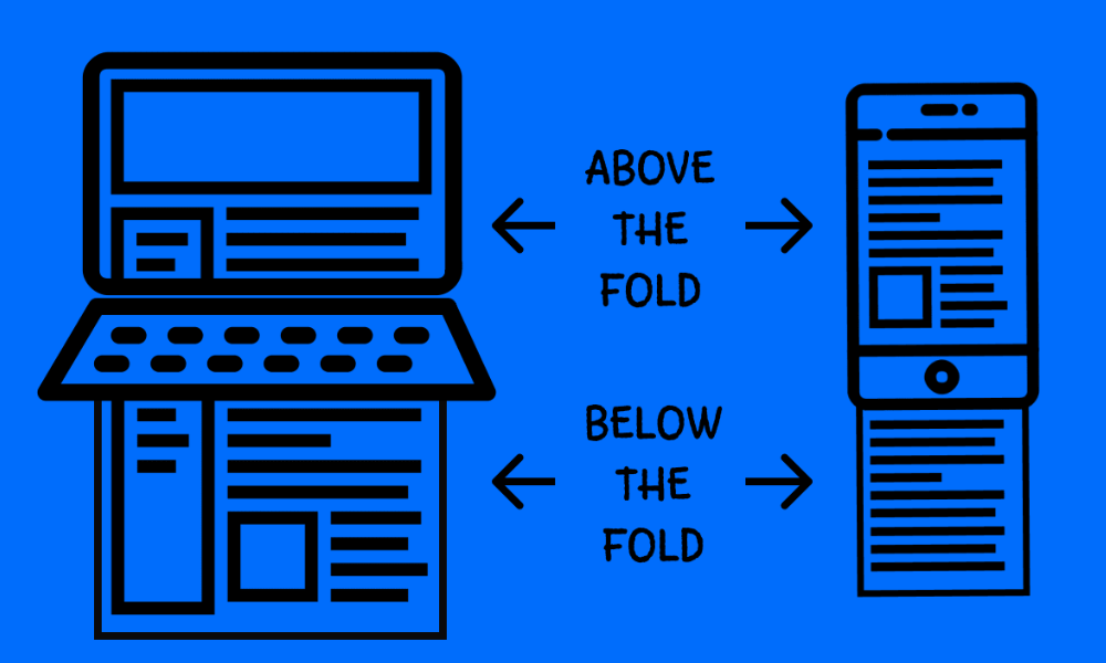
- All of your 4x4 Landing Page content needs to be above the fold (see image above).
- Your audience should only have TWO total options (subscribe or leave) on the page.
That means you should NOT have a menu bar, you should NOT have other CTAs, and your entire page should be made up of strictly your 4x4.

The first thing you need to understand is your UVP (Unique Value Proposition) and/or your newsletter's "Job To Be Done".
Without that, you will be stuck on your Main Headline.
But, once you have it, you can begin crafting the ultimate landing page around your 4 Essentials and 4 Sections.

