
I have always been surprised by how many people ask me how to brand and design their newsletter.
I'm not surprised that it's a question (it's definitely something you should be thinking about), but rather the fact that it is asked almost as much as questions about newsletter content strategy, how to get more subscribers and how to launch products.
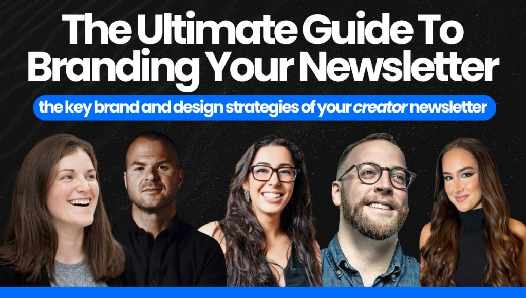
That said, you won't need another guide for branding and designing your newsletter after this one, because we're deep diving all the top newsletters.
If you haven't already read The 5 Must Have Sections Of Every Creator Newsletter, that's also a great starting point where we discussed:
- Header Branding
- Branded Signature
- PS Section
- Sponsorship Section
- Referral Section
It's important to know about all of these while planning out your newsletter design and content; and for this deep dive we'll only be re-examining header branding and your branded signature a bit deeper.
Here's a quick overview of what we'll be dissecting in this one:
- Color Choices
- Using Dividers
- Branded Emoji
- Header Branding
- Branded Signature
- Naming Your Newsletter
Some sections will have a bit more depth than others, but by the time we're done with this one, if you combine it with the your core content and the 5 sections of your newsletter you'll be ready to launch!
To accomplish this we'll be breaking down some of the world's top newsletter creators like:
- Jay Clouse
- Justin Welsh
- Chenell Basilio
- Codie Sanchez
- Katelyn Bourgoin
- Me (Creator Newsletters)
There won't be overlap for every single section and choice among all of the top creators, but that's because branding is specific to YOU.
These choices are ultimately yours and should be built around your specific style.

📬 Color Choices: Background and Font
To start off our branding discussion we'll stick to easy: color choices.
Right off the bat I can tell you with certainty that sticking to a white background and black font is always a safe bet.
You also shouldn't go too crazy with your font choice and stick to the assumption that easier reading beats fancy in almost every situation.
If you take a deeper look at Katelyn Bourgoin's Why We Buy (in the middle of the image above) you'll notice that she uses purple hyperlinks which match her yellow and purple branding.
You can't see it in the picture, but Codie Sanchez also does this with her red colored branding for Contrarian Thinking.
This won't be the best for every brand, but this is something you should consider if you have a color in your brand kit that would work well with hyperlinks and buttons.
This is similar to what I do in the deep dives with the hyperlinks matching my lighter blue color in my own branding.
In the next section we'll take a look at some of the other colors in some of the top newsletters, this time looking at sponsorship and PS sections specifically.
")
📬 Color Choices: Alternative Colors
Your newsletter will obviously also have some other colors popping up in sections like:
- Buttons
- Sponsorship Section
- Highlighted Content Sections (Boxes)
And more...
While creators may put a lot of thought into how to go about implementing these colors into their newsletter strategy, it really comes back to simplicity again.
If we start by analyzing Justin Welsh's color scheme we can make some quick notes:
- His newsletter colors directly correlate to his website and overall branding.
- Justin did a major rebrand to these colors in 2023 (you can read more about it on his website here) and wanted it to be "clean, straightforward and focused on user experience".
When we move into analyzing Katelyn Bourgoin's newsletter we can learn a lot about how these things carry over, and I want to zoom in on one specific choice she makes...
Here's what we can learn about Katelyn's Newsletter Colors and Branding:
- Katelyn sticks to simple white background, black text and adds her purple branding for links and fun branding for her dividers (we'll take a look at these below as well).
- Katelyn also uses emojis to teach, as she does in her social posts as well (which is on brand) and keeps her writing engaging and fun.
- Katelyn's branding is YELLOW and purple, but you will find virtually NO yellow inside her newsletter (other than her main logo/header branding).
The last part is what I really want to focus on here.
Yellow is NOT a good color to go on a white background.
Katelyn knows this, and instead of forcing her branding into her newsletter to try to make EVERY color work, she opts for what is best for the reader, and fits her brand in other ways that are still extremely effective.
And last, but not least, we have Jay Clouse's Creator Science newsletter.
The reason I want to highlight this one is because Jay opts for a white background, and then uses his light blue color to break up sections (usually for his sponsorship section).
The main thing I want to note is that Jay stays on-brand with his white and blue color scheme that we find on a lot of his products and social branding - but when we hit his website we find a dark background and much different branding.
So we know Jay likes the darker background with lighter writing; but again, we see that our top creators don't deter from what is best for the reader; and their email inbox.
")
📬 Using Dividers
This won't be a large section, but it's something I wanted to highlight to address a specific nuance for separating your sections.
I love seeing creators use their branded dividers like we see above.
It's another really fun way to build on your branding, and something I do with a simple divider that is made up of my branded blue color and branded emoji: 📬.
BUT, you'll also see creators diving up their sections with regular dividers (built into ConvertKit and other ESPs), and boxed sections (like Jay Clouse's sponsorship section).

Important Note: While we see creators using dividers as the primary way to break up their newsletter, and boxes to show off sponsored sections and other highlighted sections; you will find the boxed-section style much more prominent in BeeHiiv and media-brand newsletters. These newsletters use generally use a boxed section for each new section of their newsletter.
If you want to read my full breakdown of ConvertKit VS. BeeHiiv you can read that here.
BeeHiiv websites and BeeHiiv newsletters have a very distinct look to them, and is generally better for media brand newsletters.
(If you don't know what the difference between a media-brand newsletter and a creator newsletter is you can also read my deep dive on newsletter business models here.)
")
📬 Branded Emojis
Branded emojis are something we briefly discussed when we learned about optimizing our Welcome Flow (welcome page and welcome email) to increase our newsletter open rate and overall engagement.
Here are some examples I mentioned (with new ones added from the image above):
- Morning Brew uses their ☕️ emoji.
- Marketing Examined (Alex Garcia) uses his 🔍 emoji.
- I (Creator Newsletters) use my 📬 emoji.
- Chenell Basilio (Growth In Reverse) uses her 🤿 emoji.
- Matt McGarry uses his 📧 emoji.
- Creator Spotlight uses 🔴 as his emoji.
- Justin Moore (Creator Wizard) uses 🧙♂️ as his emoji
It can feel hard to find an emoji that isn't "already being used" but one thing to remember is that a lot of these creators aren't in an overlapping niche and most of your audience will likely have no idea they use these emojis.
So find one that works best for your brand, and isn't used by any prominent creators/newsletters in your niche; and make it known that when they see that emoji in their inbox it means your email is there!
How Do We Make It Known....!?
We discussed this in our Welcome Flow breakdown, but I will give a quick recap now.
Right on your Welcome Page and inside your Welcome Email (along with in the subject line of your welcome email) you should be blatantly saying:
"Note: Every email you get from me will include 📬 in the subject line."
You probably saw this when you opted into my newsletter.
And then...as you continue getting emails from me, you notice more and more that when that emoji is there: value is inside!

📬 Header Branding
Now we're really getting into the meat and potatoes of the branding of your newsletter.
All the things we have already discussed are differentiators from plain text email, regular email digital marketing and newsletters - but these next two are a MUST for your newsletter.
(These specific sections were among our Top 5 Must Have Sections of Every Creator Newsletter.)
The first one is our Header Branding.
As you can see above, all the top creators include their newsletter logo right at the top of their email.
Note: It is not shown well in the image, but these headers are the FIRST thing included in the newsletters.
The first thing you see when you click in.
This should be an absolute no brainer and easy addition to your newsletter as soon as you're launching.
Continue building your brand in every single email.
This is something we see among all types of newsletters (Media Brand AND Creator Newsletters).
But...one thing I do want to touch on is something I'm asked a lot...
🔍 What If I Don't Have A Name For My Newsletter!?
If you don't have a name for your newsletter...it's okay.
There is power in naming your newsletter, but if you don't have one on day one, you're fine.
Even top creators like Kieran Drew and Dan Koe have their newsletters named after themselves (Ex: Kieran Drew's Newsletter).
Note: These two examples are of two creators that push heavily on personal branding, so make a note of that while deciding to use your own name.
BUT...as I said, there is power in naming your newsletter and giving your audience something to associate it with.
Let's think of this quick example (using myself):
- I could build my personal brand as "Mike Romaine" and it could work.
- But, my newsletter as "📬 Creator Newsletters" builds on something highly specific in an area I want to build authority and be known for.
Closing thoughts: it's fine if you start with your name (or even a different name that you pivot out of), but the goal should eventually be to have a branded newsletter name that fits the personal category you're building for yourself.
")
📬 Branded Signature
Last up (and I might have saved the best for last) is our branded signature.
I truly think this is one of the most important parts (and I'll tell you why).
This is another one of the must have sections, and comes after your core content and before your PS Section (your gentle nudges of your products and services at the end of your email).
Remember this: your audience is being asked to sign up for TONS of newsletters every singled ay.
But they don't always remember your name or brand right way...
We optimize our branding and for engagement within our Welcome Flow, but it doesn't mean it's a surefire way to make them remember you.
What does this mean...?
This means your emails are landing in your audience's inbox and they sometimes have NO IDEA who it's from.
They scroll, don't see a face they can fit to the name they're seeing, and give up.
Read that last part again: they give up.
They WILL become disengaged and either unsubscribe or stop opening your emails.
They aren't going out of their way to click your socials to try to figure out who is sending them these emails.
Your branded signature needs to be exactly aligned with the picture of you that you use for your social feeds.
Combine this with the rest of the branding we're building on throughout this deep dive and now you're using the power of your newsletter to build trust, authority and expertise.
")
📬 Final Tips for Your Newsletter Landing Page
One of the biggest takeaways you should have from this deep dive is that simplicity and unison are key.
Brand > Everything.
Here are some main points to remember:
- You want your brand to be congruent throughout your newsletter, socials, website and all the places your audience will be consuming your content.
- You also want to make your newsletter is focused on readability, so sticking with a white background and black text is almost always the right choice (don't force your brand colors if they don't fit well).
- Your Header Branding should be the first thing your audience sees when they open your email.
- Your Branded Signature is an absolute must, and should be the same picture of you that you use on your social platforms.
- A Branded Emoji is a great way to have branding in your signature and make your emails immediately recognizable.
- Branded dividers aren't a must, but are a fun way to inject some more of your branding into your emails.
Don't overcomplicate it.
Keep it simple.
Follow the steps and slowly implement all of these things and you'll be well on your way to crushing your newsletter branding and design.
PS - I added this throughout this deep dive, but in case you skipped to the end, make sure you're also using my deep dive on the 5 must have sections of a creator newsletter.

