Not having a Welcome Page and Welcome Email (Welcome Flow) is the newsletter version of being ghosted.
Your welcome page and welcome email help you:
- Stay in your reader's inbox.
- Get them excited for more.
- Make them long term readers.
And there are proven tactics to do all three of these things.
Which is why you see these tactics being repeated in the world's top newsletters, with their own spin on them.
In this deep dive we'll be taking a look at exactly how you can optimize your Welcome Flow with specific sections that are key to higher engagement rates.
I'll be referring to the combo of your Welcome Page and Welcome Email as your: Welcome Flow.
Not to be confused with a subscriber flow (which would also include your landing page) or a welcome sequence (which are a sequence of emails you send your subscribers upon subscribing).
Just in case it's unclear exactly what I'm referring to, let's go over it.
What is a Welcome Flow?
- The Welcome Page: Your welcome page can also be called a "confirmation page" or even "thank you page". This is the page people are redirected to directly after subscribing.
- The Welcome Email: Your welcome email is also sometimes called a "confirmation email". This is the email people are sent directly after subscribing.
And these two things are absolute non-negotiables for all newsletters.
NOTE: In the final recap section at the bottom of this article I will be giving you the exact things you need to be hitting in each of these different parts of your Welcome Flow.
 A Quick Note On Double Optin
This deep dive is under the assumption that you follow my advice and use single optin instead of double optin.
As I mention in this LinkedIn carousel breaking down Justin Welsh's newsletter (which also uses single optin), double optin could lead you to losing 20-40% of potential subscribers.
The Welcome Flow we're discussing in this article (paired with list cleaning strategies we'll discuss in a future newsletter) are the exact things that we use to optimize for sender reputation and engagement.
 What Are We Optimizing For?
There are three specific things that we are optimizing for in our Welcome Flow.
- Get A Reply: Get our audience to reply to our email.
- Move To Primary: Get our audience to move our email to primary (if it didn't land there).
- Get A Click: Get our audience to click a link within our email.
- What To Expect: Tell our reader's what to expect and get them to look forward to our future emails (more opens, higher future engagement).
Each of these things can help our sender reputation and allow us to continue to land in our reader's inbox.
The first two on this list are the priority, but optimizing for a click is also a nice double whammy with providing immediate value and building trust - and telling our reader's what to expect is a massive part of building our branding.
Our Welcome Flow can also be a great place to make an initial sale, and I have had some incredible success with Welcome Offers (especially with my fitness newsletter), but they are generally better for newsletters that have a high amount of volume, or who are looking to eventually self-liquidate ad spend.
For most, though, it isn't going to be the most optimal option.
For now we'll be sticking to how we structure each section of our Welcome Flow with the top optimizers we're looking to hit.
Starting with our Welcome Page:
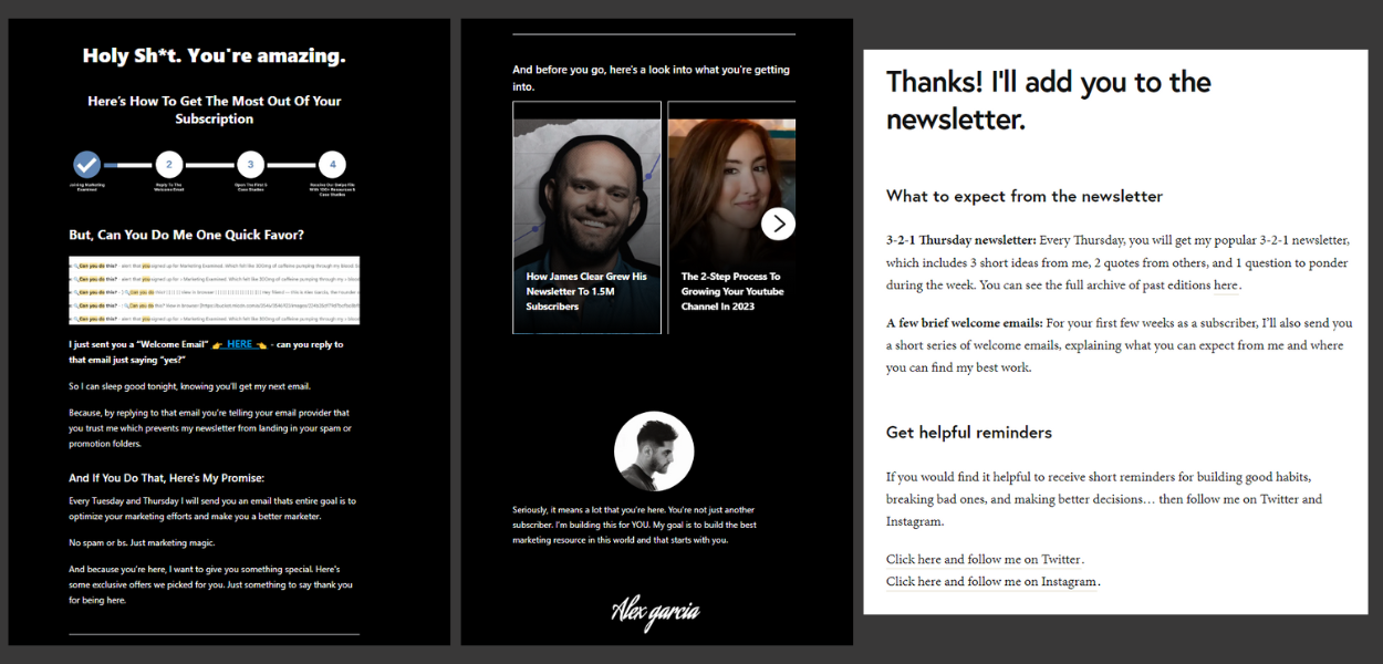
 The Welcome Page: Alex Garcia & James Clear
Your Welcome Page is going to be optimizing for a lot of what we discussed, but we also have the opportunity to emphasize the "What To Expect" and provide a bit of value.
The images you see above are:
- Left 2 Images: Alex Garcia (Marketing Examined)
- Right Image: James Clear (3-2-1 Newsletter)

I like sharing Alex Garcia's Welcome Page because he hits all the points we're looking to hit, and does it with a bit of flair and personal touch.
Here's what he says:
"I just sent you a “Welcome Email”.
Can you reply to that email just saying “yes?”
So I can sleep good tonight, knowing you’ll get my next email.
Because, by replying to that email you’re telling your email provider that you trust me which prevents my newsletter from landing in your spam or promotion folders.
And If You Do That, Here's My Promise:
Every Tuesday and Thursday I will send you an email thats entire goal is to optimize your marketing efforts and make you a better marketer.
No spam or bs. Just marketing magic.
Right away Alex:
- Tells you about the Welcome Email.
- Works on getting the reply (even before you open the email!).
- Tells you what to expect.
Your Welcome Flow does a lot of guiding your subscriber.
Guiding them to the Welcome Email; guiding them to value; guiding them to future emails (what to expect).
From there Alex provides us with a handful of his top case studies (you can see the image of James Clear and Codie Sanchez above, which link to some awesome deep dives).
Immediate value add.

On the right side of the image above we can see James Clear's Welcome Page.
I share this one because I want to show how simple you can keep your page, while still optimizing for the things you need to hit.
James tells us:
- Exactly what to expect from his newsletter.
- Emails that are already coming our way.
- Links to his social to keep us in his ecosystem.
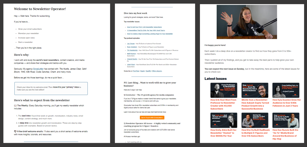
 The Welcome Page: Matt McGarry & Chenell Basilio
Sticking to our theme of long and in depth VS. short and sweet, I want to take a look at two more Welcome Page examples before we make our way into The Welcome Email.
This time we're looking at:
- Left 2 Images: Matt McGarry (Newsletter Operator)
- Right Image: Chenell Basilio (Growth In Reverse)
Your Welcome Flow is what you make of it.
There's no right or wrong way, but there are definitely specific things that should always be touched upon, which you'll continue to see on every one of these pages.
(And I'll recap at the bottom as well).

Matt McGarry takes us through a LONG welcome page, but does it smoothly, hitting all the markers that an be optimized for, and more.
Here's how it goes:
- Why you belong here.
- Why we should trust him.
- What to expect from the newsletter.
- The emails that are already headed our way.
- Valuable resources we can dive into right now.
- Three different ways he can help us (paid options).
Do you have to go into this much depth?
Of course not.
But Matt covers the biggest things [and more]:
- What to expect.
- Emails on their way.
- Immediate value add.
And we'll see Chenell does the same in a short and sweet version next.

In the right image we see just about the entire Welcome Page.
(The only thing missing is a small 2 line section that Chenell adds with her Twitter and LinkedIn links o keep people in her eco system).
Here's what Chenell writes in her Welcome Page:
I’m happy you’re here!
Each week I do a deep dive on a newsletter creator to find out how they grew from 0 to 50k+ subscribers.
Then I publish all of my findings, and you get to take away the best parts to help grow your own newsletter audience.
You can expect the next issue on Sunday, but in the meantime, here are some of the latest issues for you to check out:
And then she proceeds to share some of her top deep dives, like we saw from Alex Garcia.
As we an analyze, Chenell hits all the markers we've been seeing:
- What to expect from the newsletter.
- When you're going to get it.
- Immediate value add.
Again, in the final section below I will be going every single thing you should be hitting in your Welcome Page, as well as each thing you should hit in your Welcome Email.
 BONUS: Welcome Email Subject Lines
Our job is to get our audience to open our Welcome Email.
If they don't open it, we lose our chance of optimizing for each of the things we're looking to achieve.
Part of doing that is by writing an interesting and attention grabbing headline.
But, in reality, it's sometimes as simple as not being boring...
We want to add flair, and show our personality if we can.
We DON'T want to say "Welcome To [Insert Newsletter Name]"...
I'll give you a second to go change your subject line...
Here are some examples of good Welcome Email Subject lines:
- The Hustle - Look what you did, you little jerk
- MorningBrew -
Caution: Morning Brew coming in hot
- Jay Clouse - Hey! Quick question for you…
- Milk Road - bada bing bada boom. You're on my private web3 list.
- Marketing Dive - Thanks for signing up! A few things to know…
- The Publish Press - Quick favor to ask
- Niall Doherty - You're in. Here's what's next…
- Tim Bourquin - Who said you could join my newsletter?
- Justin Welsh - It's Time to Upgrade Your Saturday
- Alex Garcia -
Can you do this?
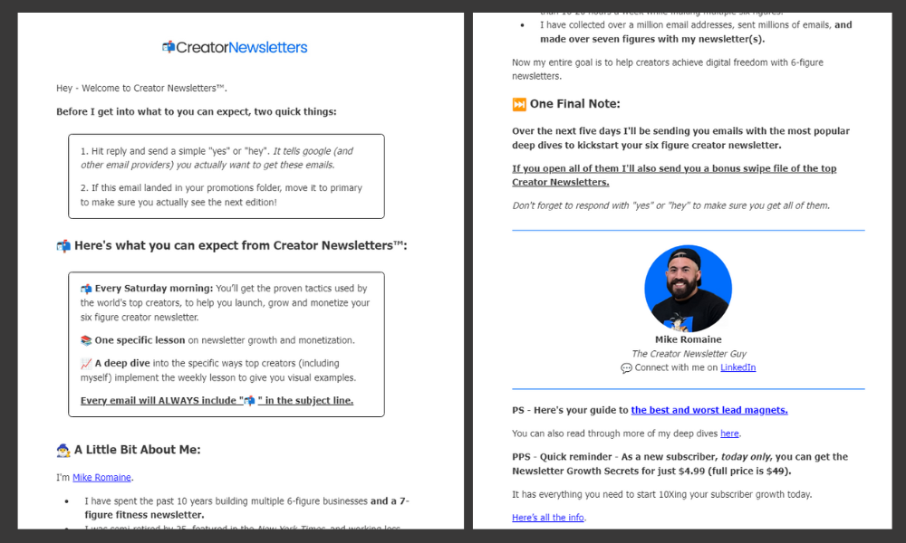
 The Welcome Email: My Welcome Email (Creator Newsletters)
Rather than use myself as an example for every single section, I wanted to throw myself in for the Welcome Email being that I personally think I hit every marker that needs to be met in a nice structure that you can easily replicate for yourself.
As you can see in the images above, my welcome email starts with this:
- Optimize for reply and move to primary (the two BIGGEST things).
- Tell them what to expect from the newsletter.
- BONUS: Branded Emoji (I discuss this below).
- A little bit about myself to build authority.
- What to expect in the coming emails.
- Optimize for click with a deep dive on lead magnets and the rest of the case studies.
It doesn't get much better than that!
Feel free to steal my exact format and make it your own.
The only thing I have considered changing about my welcome email is whether or not I want to give multiple resource links at the bottom of the email or send people to all the deep dives.
(Keep in mind: I give a long list of top resources on The Welcome Page)
I'm testing both ways, and the click rate has not changed too much, so that is up to you.
Right now I prefer just having the two links so it doesn't look cluttered.
 The Welcome Email: Alex Garcia
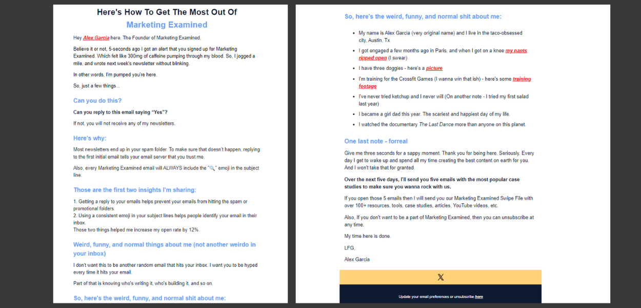
One more longer Welcome Email that I want to take a look at before I analyze two short examples is Alex Garcia, who we looked at in the beginning of this deep dive.
For the same reasons I wanted to bring him in for the top section, I want to discuss Alex's Welcome Email because of his flair and personal touch.
Note: Alex's newsletter is actually branded as Marketing Examined and found at that URL (not his own name), unlike a newsletter like Justin Welsh's who is his personal brand with a branded newsletter attached to his name.
This makes it even more unique that Alex adds this much personal touch to his Welcome Flow.
Here's how Alex starts off his Welcome Email:
Hey Alex Garcia here. The Founder of Marketing Examined.
Believe it or not, 5-seconds ago I got an alert that you signed up for Marketing Examined. Which felt like 300mg of caffeine pumping through my blood. So, I jogged a mile, and wrote next week's newsletter without blinking.
In other words, I'm pumped you're here.
So, just a few things...
Can you see what I mean when I talk about his personal touch and flair?
For some people it might be a bit over the top, but Alex is making himself stand out.
From there Alex moves on to a few more sections:
- Ask for the replay (and explain why).
- Branded Emoji (more on this below).
- Tells us what to expect in future emails (and the next 5 days).
- Shares a full section of himself ("Weird, Funny and Normal Shit") and optimizes for a click.
Again, there are so many ways to accomplish the things we're looking to achieve in our Welcome Flow - so it's important to make it YOURS.
 The Welcome Email: Justin Welsh & Chenell Basilio
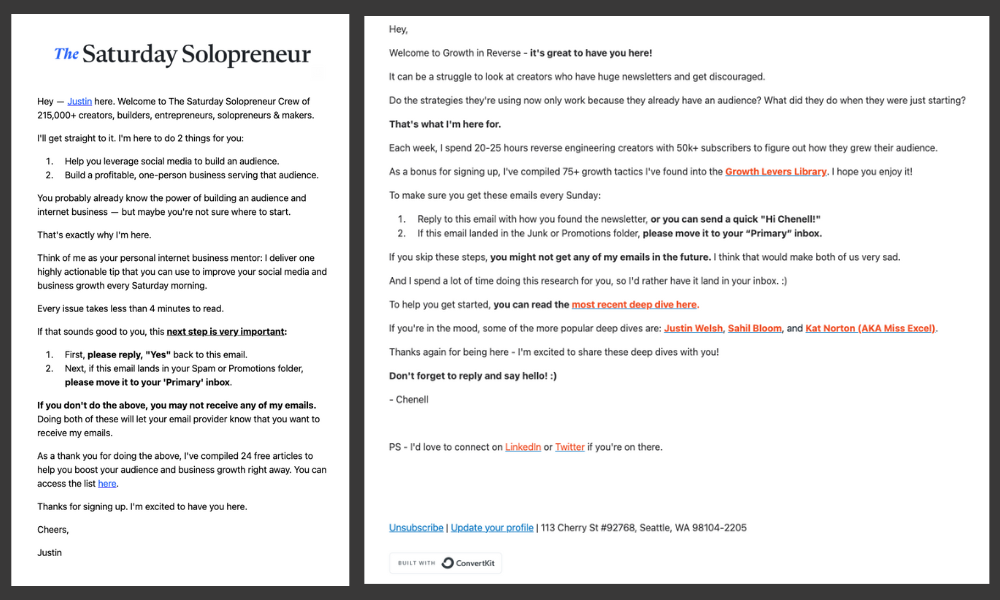
The last two emails I want to look at to wrap up our Welcome Email section are from Justin Welsh and Chenell Basilio.
Both of these emails are short and sweet (like we saw from Chenell's Welcome Page as well), but optimize for exactly what we're looking hit on.
I wouldn't be surprised if Chenell pulled some inspiration from Justin's Welcome Email when she was building hers, but whether she did or didn't, she definitely adds her own personal touch.
That said, both of them:
- Tell us what to expect from the newsletter.
- Ask us to reply to the email.
- Ask us to move to primary.
- Share a link to more resources/value.
By now, if not a long time ago, you should be seeing a clear trend here.
 BONUS: Consider A Branded Emoji
You may have noted that a handful of the creators I shared in this email use branded emojis for their emails.
What this means is that we establish an emoji that the reader can use to see us stand out in their inbox.
Similar to other forms of branding, it's something that allows us to be remembered.
Here are some examples:
- Morning Brew uses their
emoji.
- Marketing Examined (Alex Garcia) uses his
emoji.
- I (Creator Newsletters) use my
emoji.
- Chenell Basilio (Growth In Reverse) uses her
emoji.
- Matt McGarry uses his
emoji.
Each of us establishs our branded emoji on our Welcome Page, in our Welcome Email (and in the subject line, of course), and in every single future email we send.
This is just another layer of the branding I discussed in my breakdown of the 5 must have newsletter sections of every Creator Newsletter.
 The Welcome Flow Recap
While you should add your own personal touch (and flair), there are definitely very specific things you want to optimize for in each of these sections of your own Welcome Flow.
Let's start with your Welcome Page.

Tell our readers what to expect from our newsletter.
This means we're telling them:
- What they're getting in the newsletter(s).
- When they should expect the newsletter each week.
- About any emails coming their way (other than the regular schedule).
- Establish your branded emoji (if you plan on having one).
- Provide immediate value (link to resources).
And here are some bonus optimizers for your Welcome Page:
- Start building some authority (share some of your background).
- Keep them in your ecosystem (share some of your social links).
NOTE: The social links should be a secondary goal and should come after you've already established the rest of your optimizers.
Which brings us to our Welcome Email.
(For this section I'm going to be assuming you're already optimizing your Welcome Email subject line).

- Ask our reader to reply to the email.
- Ask our reader to move us to primary inbox.
- Provide resources that optimize for a link click.
Secondary Optimizers To Reiterate (But Still Essential):
- What they're getting in the newsletter(s)
- When they should expect the newsletter each week.
- Any emails coming their way (other than the regular schedule).
- Establish your branded emoji (if you plan on having one).
And there you have it.
An optimized Welcome Flow.
Make sure you're optimizing for all of these things I have listed above, add your own flair, and you're on your way to higher open rates, more engagement, and a successful Creator Newsletter.

