One of the biggest mistakes creators make when starting out on LinkedIn is not optimizing their LinkedIn profile to it's full potential.
Some creators will click around and look at other profiles and attempt to improve theirs, but unfortunately the same mistakes occur over and over again (for the same reasons):
- Not being clear on what you do.
- Not building any authority in what you do.
- Not standing out or specializing in what you do.
And, of course, there are also little tips and tricks that a lot of creators don't take advantage of that I will be covering as well.
With a special focus on newsletter optimization (if that wasn't obvious).
But let's get one thing clear here before we even start...
Your profile is not about you.
It's about who and how you serve.
This will become much more clear as we make our way through some of the sections of your profile and how you can optimize them.
You will also need to make the decision on what you want to optimize for:
- Sales
- Clients
- Subscribers
Can you add CTAs (Calls To Action) for all of them?
Sure. But every additional call to action takes away from the others.
So I will also be showing you how some creators choose to optimize for specific things rather than minimize them by trying to optimize for multiple.
By the end of this deep dive you'll have handfuls of options for all different aspects of your profile, but even being armed with the right tactics still doesn't change the fact that it's entirely based on YOU and YOUR positioning, brand and overall goals.
📬Step #1: Your LinkedIn Banner
I'm going to go straight out and say it:
The LinkedIn Banner is the most overrated section of the LinkedIn profile.
Why do I say this...?
Because LinkedIn creators tend to put far too much focus on this part of their profile, when in reality you can win without it...fairly easily.
Does that mean you should neglect it?
Of course not.
But it DOES mean you should keep it simple and then optimize what is going to make even more of a difference.
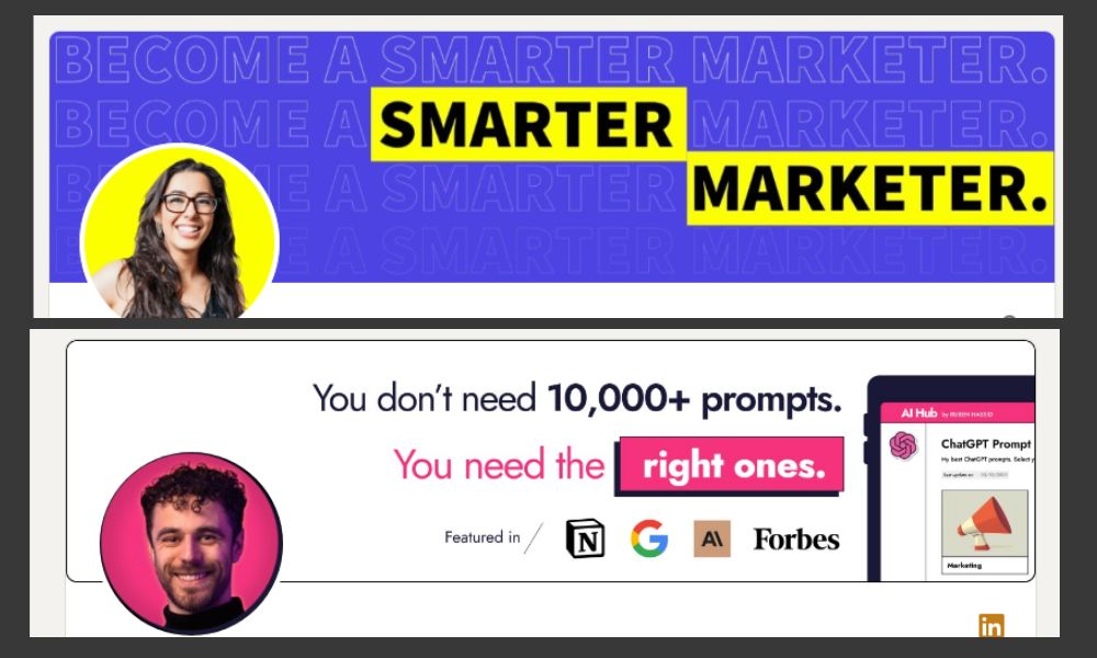
 Katelyn Bourgoin (Top Image):
Let's take Katelyn Bourgoin's banner in the image.
Extremely simple, but tells you exactly what she can do for YOU.
Here's what Katelyn communicates immediately:
- She's professional.
- She can help us become a smarter marketer.
If this is something we're interested in, then we will move down to her bio section, which is where the REAL power comes in your LinkedIn profile.
 Ruben Hassid (Bottom Image):
You can stick to extremely simple like Katelyn and still win (Katelyn has nearly 70K followers and a MASSIVELY successful newsletter).
But you can also take it a small step past that and opt for a still simplistic, but a little more authority building design like Ruben Hassid
This is my preferred style.
If you can't add a "Featured In" section, the easy solution is to cut it and just have 2 simple lines about how you're going to help your audience.
Mine is this: "Write your way to digital freedom."
And then from there I take you down into my bio section, which we'll discuss shortly.
 Key Takeaways:
You will likely see a lot of LinkedIn "Gurus" telling you how important your banner section is.
And it is important.
But it's not something you need to put the majority of your focus in on your page.
It should stem directly from your already existing branding.
Example: If you already have a coined phrase, or specific copy that encapsulates what you do from people (as you should): then this is where it belongs.
No need to overcomplicate it.
So here are my key takeaways:
- Keep it simple.
- Tell us who you serve.
- Give us a reason to read your bio.
 Extra Learning:
You can also check out these creators banners for some simplistic but effective banners:
📬Step #1.5 - Newsletter Banner Optimization
As you start to grow significantly on LinkedIn you might want to start thinking about using your banner section to nudge your audience to your newsletter.
I have personally found that this didn't increase my subscribers, and my bio section testing did far more.
BUT, I also don't have 250,000-500,000 followers and hundreds of thousands of people visiting my page - so I can see why this could eventually be effective.
And, considering I'm the Creator Newsletter Guy, you should have expected sections like this to be included in here!
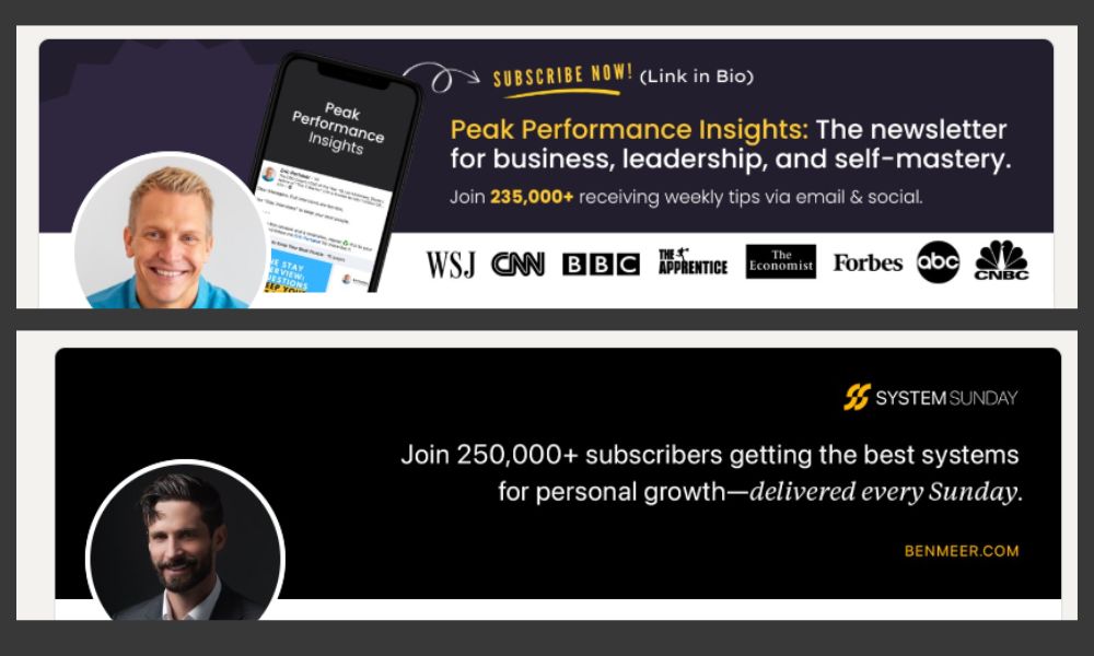
 Ben Meer and Eric Partaker:
I'm not going to analyze each of these creators separately because I think you can get the gist of what we're discussing here, and instead I just want to add a small section giving you an overview of how they do it.
As you can see, these creators (and others I will add below) choose to tell you exactly what their newsletter is about, and use it as an immediate call to action.
This is extremely powerful in some cases (as I said, generally once you have thousands of people visiting your page), and something you should be testing as your begin growing.
 Key Takeaways:
These creators KNOW their newsletter is the driving force for their business.
All roads should lead to the newsletter, so they're optimizing for that accordingly.
So here are my key takeaways:
- Extremely effective as you begin getting a lot of profile views.
- Should be tested, but not as effective early on.
- Extra call to action for newsletter = quick win.
 Extra Learning:
Here are creators who optimize for their newsletter growth in their LinkedIn Banner:
📬Step #2 - Your LinkedIn Bio Section
This is usually THE most important part of your entire LinkedIn profile.
Did you know less than 5% of people visiting your page make it down to your "About" section?
You're lucky if they even stop to look at your Featured Section or scroll far enough to take a peak at more of your content.
And the only way to get them to do ANY of that, is by having an optimized bio section.
Before we take a look at the two images above, I want to start by reiterating something, and also giving you a BIG no-no for your bio section.
#1 - Let's start with this:
Your profile is not about you.
It's about who and how you serve.
And your bio section should be SCREAMING the exact audience you serve.
#2 - The biggest mistake I see:
If you use your bio section to look exactly like every other creator on the platform you are doing yourself a disservice.
Here's a few examples of how you can start your bio section to be like everyone else:
- Copywriter
- Ghostwriter
- Solopreneur
Okay, great...you and everyone else. How does that help me?
Your bio section is your biggest chance at specializing and differentiating yourself from the sea of sameness that surrounds the platform.
You have their attention, now tell them why they should continue paying attention.
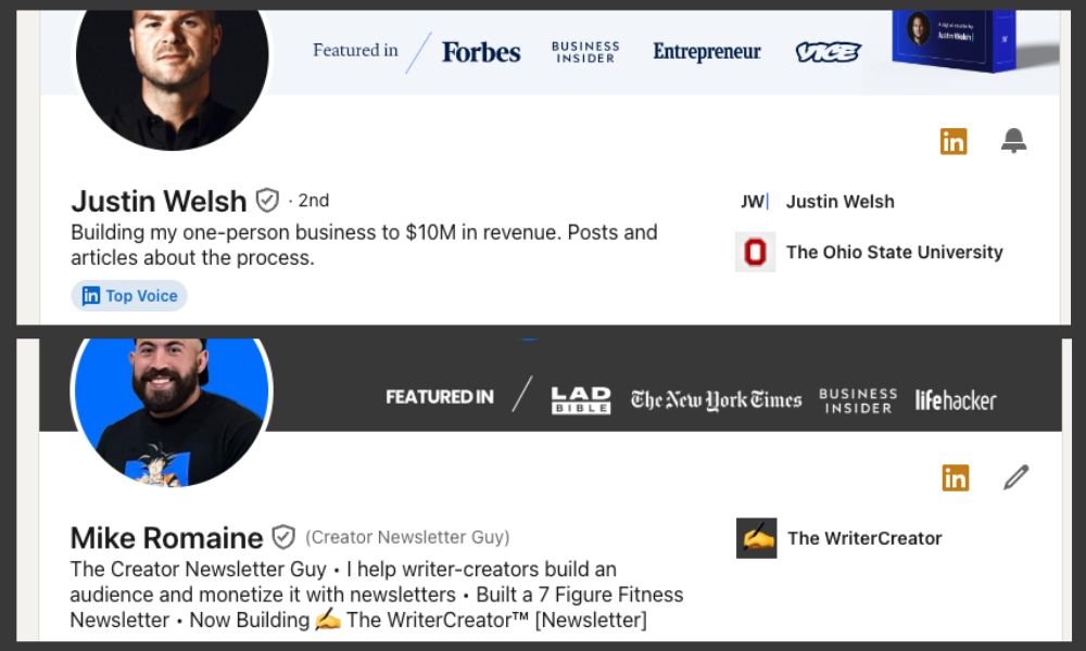
 Justin Welsh (Top Image):
A lot of new creators will go to large creator's profiles and assume they should "optimize" their page by becoming similar to those creators.
This is another big no-no.
This is likely the OPPOSITE of what you want to do.
I have a handful of screenshots of Justin Welsh bio sections that all read different things as he was growing on the platform, and none of them are nearly as broad as he is capable of being now that he has over 500K followers.
Here are some examples:
- I coach SMB SaaS founders to accelerate recurring revenue toward $50M.
- I deconstruct audience and income growth for LinkedIn creators.
- The Diversified Solopreneur | Building my one-person business to $5M in annual profit and sharing everything I learn along the way.
So why would you try to emulate where a massive creator is NOW...if that's not how they got there!?
Instead, you need to use your bio section to tell me exactly what differentiates you, and exactly why I need to keep reading.
 Mike Romaine [Me] (Bottom Image):
The bottom example might look a bit more crowded, but I also don't have 500,000 followers (yet).
I have to tell people landing on my profile EXACTLY how I serve them, build my authority (so they stick around), and build my own personal category.
Here's how I do that:
- The Creator Newsletter Guy (My Personal Category)
- I help writer-creators build an audience and monetize it with newsletters (Exactly who I serve, how I can help, and expanding on my personal category)
- Built a 7-Figure Fitness Newsletter (Building my authority as The Creator Newsletter Guy)
- Now Building The WriterCreator [Newsletter] (Leading into a Call To Action)
Do you have to do all of this?
Of course not.
But this is what I'm currently testing, and this is what is currently working extremely well for me.
 Key Takeaways:
I don't want to be like everyone else.
I don't even want to be like anyone else.
I want to differentiate, stand out, specialize, and build my own personal category.
So I highlight that throughout my bio section and build on it for my audience.
Again: your audience should know exactly how you're going to help them when they read your bio section.
So here are my key takeaways:
- Continuously test and adapt as you grow.
- This is the most important part of your profile.
- Use this attention you have to build your personal category.
- It's not about you, it's about your audience and how you help them.
 Extra Learning:
You can also check out these creators banners for some simplistic but effective banners:
These are all smaller creators for a specific reason.
📬Step #2.5 - Your Bio Section Call To Action
This next section is something I want to make sure not to skip over, but again, something we can cover extremely quickly.
This is your bio section link, or call to action.
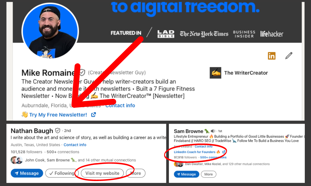
As a premium member you have the option to set it up as a website button (as you see Nathan Baugh using in the image above), but you don't get an extra button, you get one or the other.
So I'll just go straight out there and say it:
- I have tested this as extensively as I can.
- This IS something we can learn from the big creators on.
- You should likely just steal my exact strategy and use it for yourself.
Plain and simple.
The only reason you wouldn't want to do use my exact strategy is if you are not optimizing for your newsletter yet, in which case you'll want to use the Sam Browne approach that I highlight in the lower right section of the image.
BUT, if you're awesome (which I know you are because you're subscribed to my newsletter and reading this right now), then you should be optimizing for your newsletter growth and just go right ahead and use what is known to work best.
This is the same CTA you'll see from newsletter creators like Ben Meer, Jade Bonacolta, and more - and the "TRY" phrasing is a gentle nudge proven and tested by Morning Brew.

- Steal what is proven to work most effectively.
- Use a gentle nudge with "Try" as your CTA.
- Stick with the regular CTA link instead of the "website button".
📬Step #3 - Your LinkedIn Featured Section (And A Mini-Hack To Use)
Your Featured Section is prime real estate and a HUGE opportunity that LinkedIn gives us to add some awesome CTAs to our profile.
Right now it's becoming harder and harder to drive people off social platforms with external links, so the fact that LinkedIn is still giving us this section is incredible.
Yet I still see people using it for extremely random things...
Here are a list of things you're wasting your Featured Section on:
- Featured Posts
- Regular Website Links
- Anything that isn't a direct CTA.
This should be pretty straight forward, but if you don't get it, just read the third point a few times to really make it stick.
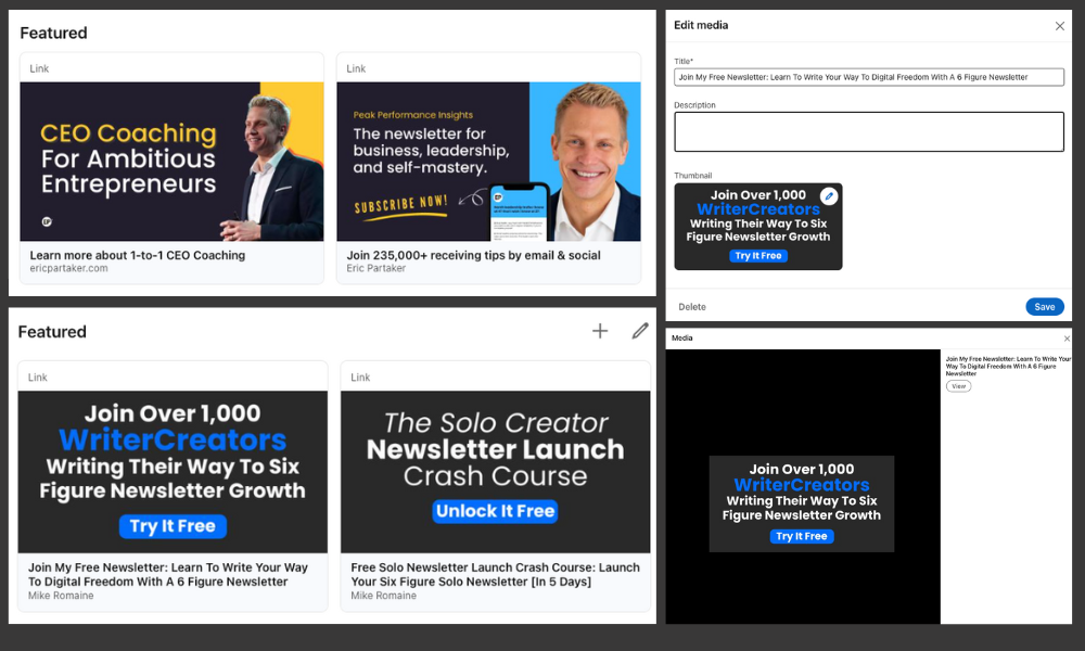
 Eric Partaker and Mike Romaine (Me):
This is another one where I really don't have to zoom in on each of our creators individually, but I did want to make sure to show you a couple different variables with both images.
As you can clearly see:
- I am optimizing entirely for newsletter growth.
- Eric is also optimizing a CTA for his coaching offer.
- We both keep it to two items MAX in the featured section.
If you check out other creators we've discussed in this deep dive you'll find:
- Ben Meer also optimizes for coaching + newsletter growth.
- Jade Bonacolta does the same as Ben and Eric.
- Nathan Baugh only has ONE item, and it's for his newsletter.
- Katelyn Bourgoin optimizes for her new digital product release + newsletter growth.
It is pretty standard to see only 1-2 items in the featured section is the winning formula, and what you choose to add as your second item (with your newsletter CTA) is going to come down to your specific value ladder and goals.
 Bonus Mini-Hack:
One little mistake I see people make is including a description in their featured section items.
When you do this, it adds a secondary interaction for your audience.
Here's what I mean:
- NO Description: 1 Click on Featured Item and Immediately Off-Site
- WITH Description: First Click takes to Pop-up and Second Click Needed
The bottom right image you see among the images in this section is the pop up you would see if I had a description in my featured section items.
This is what we call "sludge" (the opposite of a nudge), which is anything that makes it more difficult for your audience to take action.
Get rid of this sludge, and don't include a description.
📬Step #4 - Your LinkedIn About Section
As I mentioned above, less than 5% of users are ever going to read your About Section.
That doesn't mean it's not important.
But you should be aware that it is not as vital as some creators sometimes make it seem.
Instead of breaking down the entirety of what you can do with your about section, I just want to look at a couple things you NEED to do with it, and SHOULD do with it; and then give you some inspiration with other creators.
Here's what you need to know:
- The About Section has a "See More" button the same way a LinkedIn post would. You NEED to optimize this section with a hook the same way you would with a post.
- This is where you are telling your audience exactly how you can help them. Share testimonials if you want them to hire you, tell them the best options to work with you, and make the process as clear and easy as possible.
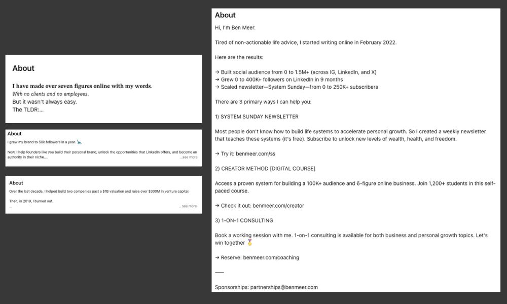
Ben Meer has one of my favorite About Me sections overall, but I also want to take a closer look at some hooks creators use.
Here's a few About Me Hooks I like:
- Mike Romaine (Me): "𝐈 𝐡𝐚𝐯𝐞 𝐦𝐚𝐝𝐞 𝐨𝐯𝐞𝐫 𝐬𝐞𝐯𝐞𝐧 𝐟𝐢𝐠𝐮𝐫𝐞𝐬 𝐨𝐧𝐥𝐢𝐧𝐞 𝐰𝐢𝐭𝐡 𝐦𝐲 𝐰𝐨𝐫𝐝𝐬. 𝘞𝘪𝘵𝘩 𝘯𝘰 𝘤𝘭𝘪𝘦𝘯𝘵𝘴 𝘢𝘯𝘥 𝘯𝘰 𝘦𝘮𝘱𝘭𝘰𝘺𝘦𝘦𝘴. But it wasn’t always easy. The TLDR:"
- Justin Welsh: "Over the last decade, I helped build two companies past a $1B valuation and raise over $300M in venture capital. Then, in 2019, I burned out."
- Sam Browne: "I grew my brand to 50k followers in a year.
Now, I help founders like you build their personal brand, unlock the opportunities that LinkedIn offers, and become an authority in their niche."
- Ben Meer: "Hi, I'm Ben Meer. Tired of non-actionable life advice, I started writing online in February 2022."
Hopefully as a LinkedIn creator you're already actively thinking about hooks.

- Optimize the hook.
- Make it easy to work with you.
- Build on your authority.
📬Step #5 - Your LinkedIn Experience Section (And Another Mini-Hack To Use)
Your LinkedIn Experience section is going to be similar to your About section in the sense that it isn't THAT impactful overall, but it does come with some extra usefulness that you should be taking advantage of.
And by usefulness, I actually mean that you can give yourself a bonus CTA external link if you do it right!
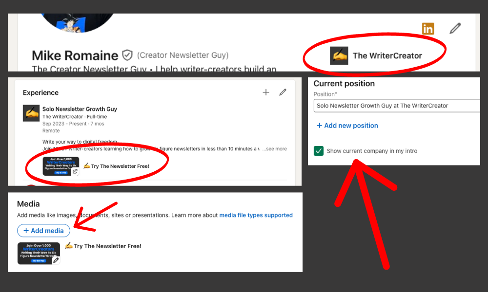
As you can see above, my experience section not only shows "Solo Newsletter Growth Guy" at The WriterCreator, but it also has another call to action that will send people off LinkedIn and directly to my newsletter landing page.
Also, if you look at the top right red circle you'll see that I also include my current position at the top of my page, near my bio section.
This acts as a jump link directly down to my experience, essentially bringing them direct to my new external link CTA for my newsletter.
Here's how you implement all of this:
- Set up your newsletter as a company on LinkedIn.
- Add to your experience, putting yourself as the owner of the company.
- After you have it set up, add media to your experience section that is an external link directly to your newsletter landing page.
- Go back up to your bio section and edit that section by choosing "Show current company in my intro" to add the jump-link.
This should take you a total of maybe 5-10 minutes, max, and add another effective call to action to your LinkedIn profile that just keeps on driving leads.
📬 Final Notes And Takeaways For An Optimized LinkedIn Profile Page
By now you probably know what I'm going to lead with, but I'm going to say it anyway just to make sure you leave this deep dive with it in your head:
Your profile is not about you.
It's about who and how you serve.
It's okay to change and adapt over time. Actually, you SHOULD be doing that. But always come back to remember it's about your audience...not you.
You are just the guide.
Here are a few more things to remember as you go optimize your LinkedIn Profile:
- Don't emulate big creators expecting what they're doing NOW to work for you. They more than likely did something completely different to get there.
- Constantly test, learn, adapt and pivot.
- Make it clear what YOUR goals are, and optimize for them (hopefully your main goal is newsletter growth because you already know that will be the driving force of your entire business).
And if you want to pair this with some other material that will help you and your Creator Newsletter business along the way, I recommend starting here:

 2-hour Newsletter System
 BLACK FRIDAY SALE on The 2-Hour Newsletter System! $150 off through Monday 11/2!